The world of web design has undergone a dramatic shift in recent years. With the ever-increasing dominance of mobile devices, the way users interact with websites has fundamentally changed.
Website design needs to change in accordance with these differing usage patterns and screen limitations. This blog explores mobile vs desktop UX design, reinforcing best practices that empower you to create optimal website experiences on any device.
Table of Contents
Beyond the Desktop Mindset: A Mobile-First Design Philosophy
While desktops were once the primary gateway to the internet, today mobile devices have become an extension of ourselves. Their portability, always-on nature, and touch screen interfaces necessitate a design approach that prioritizes mobile usability.
When considering desktop vs mobile UX design, we have to tailor our approach to suit the device we are designing for. While desktop UX principles are fairly well ingrained, we have to consciously work on inculcating best practices for mobile-first UX design too.
Key Considerations for Mobile vs Desktop Design
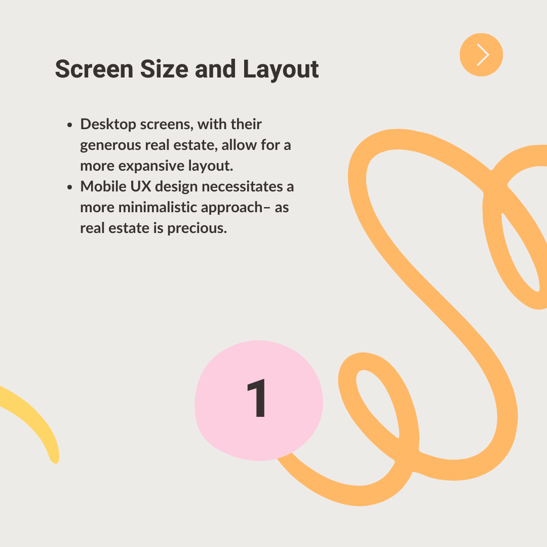
- Screen Size and Layout
Desktop screens, with their generous real estate, allow for a more expansive layout. Designers can leverage multiple columns, sidebars, and footers to create a clear hierarchy and guide users through the information architecture.
For a news website – desktop users might see headlines displayed side-by-side with featured articles and supplementary content like weather or sports updates neatly organized in separate sections.
In contrast, mobile UX design necessitates a more minimalistic approach– as real estate is precious. Designers must prioritize essential information, often opting for a single-column layout for optimal readability on smaller screens.
Think of that same news website on a mobile device. Headlines would likely stack vertically, with key articles prioritized at the top, followed by scrollable sections for additional content.
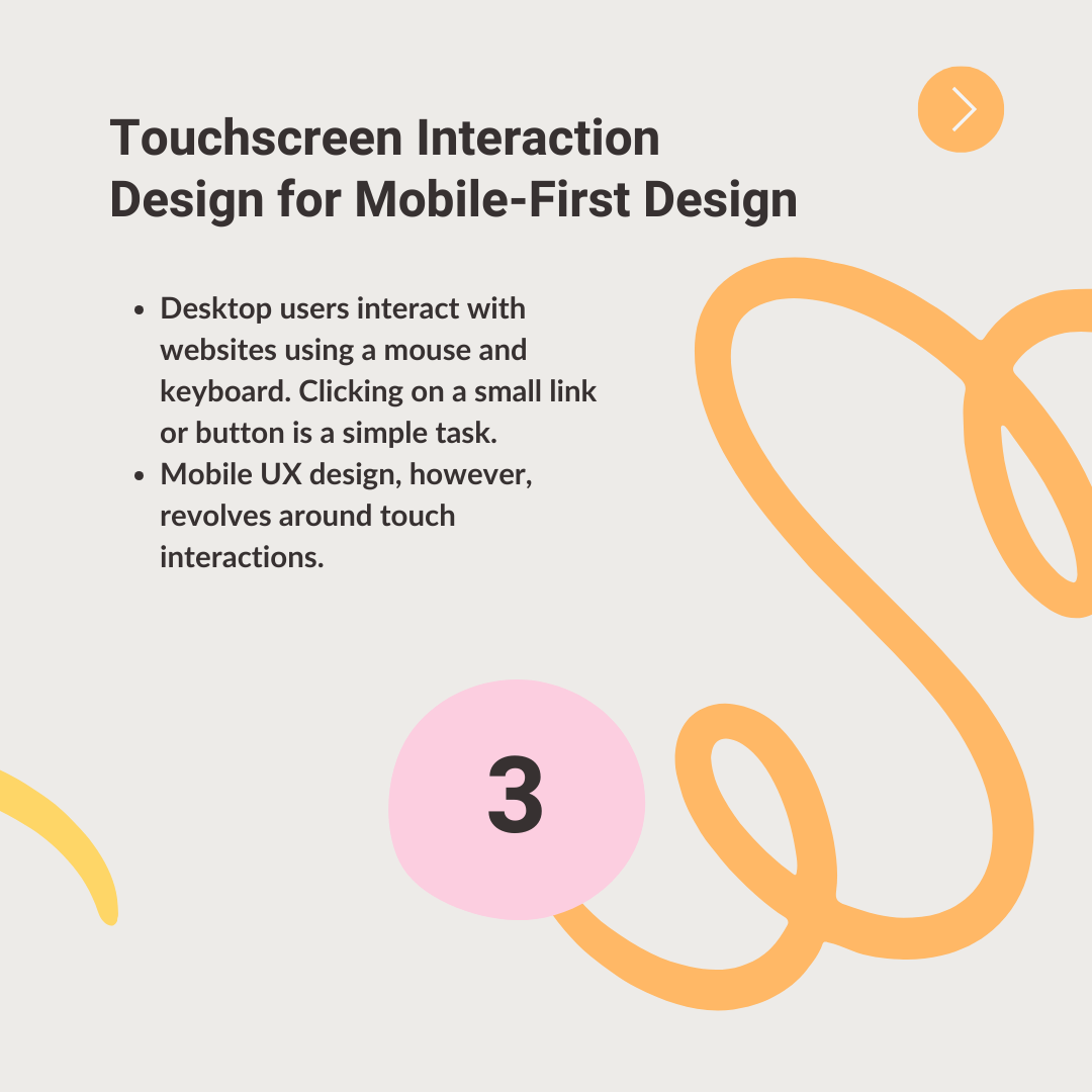
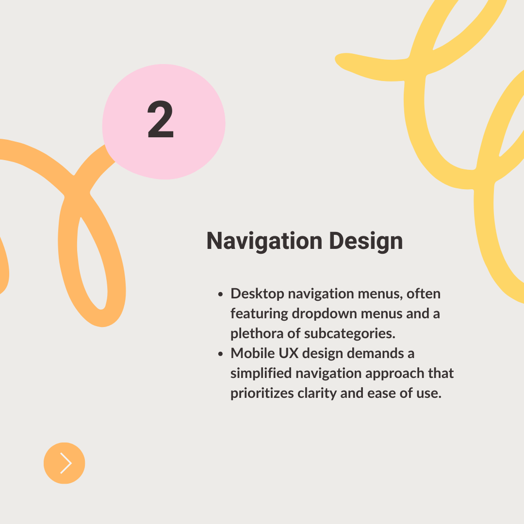
- Touchscreen Interaction Design for Mobile-First Design
Desktop users interact with websites using a mouse and keyboard. Clicking on a small link or button is a simple task.
Mobile UX design, however, revolves around touch interactions. Our fingers are not as precise as a mouse cursor, so buttons and other interactive elements need to be designed with this in mind.
Elements should have ample spacing to avoid accidental taps on neighboring elements. By ensuring a minimum touch target size, you can ensure users can easily interact with buttons and links without frustration.
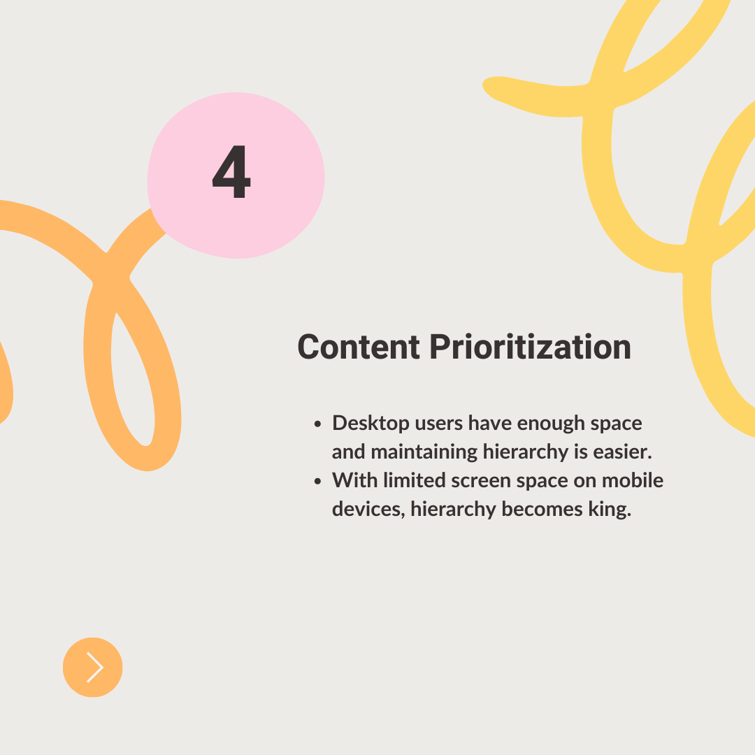
Leveraging swipe gestures for intuitive navigation can also enhance the mobile user experience, as users are accustomed to using swipe gestures in various apps. Incorporating them into your website design creates a familiar and intuitive user experience. - Content Prioritization for Desktop vs Mobile Design
With limited screen space on mobile devices, hierarchy becomes king. Identify the most critical information for mobile users and prioritize its presentation.
Headlines, subheadings, and key product details – these should be clear and concise, grabbing the user’s attention within the limited viewport. Additional details or supplementary information can be offered through expandable sections or hidden menus.
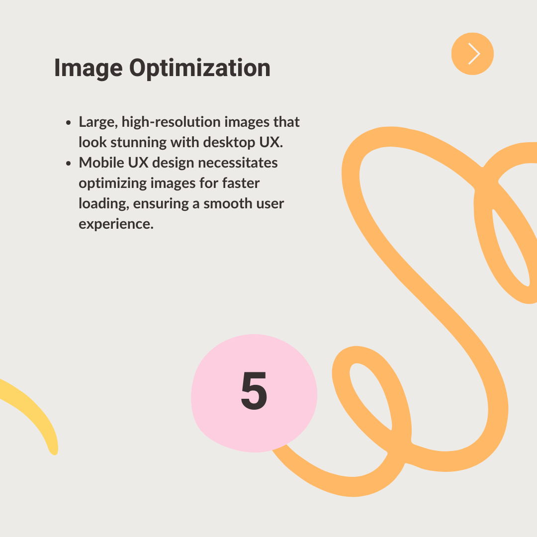
Consider using bolding or contrasting colors to highlight important calls to action (CTAs), further guiding users towards completing desired actions on your mobile website. - Image Optimization
Large, high-resolution images that look stunning with desktop UX can lead to slow loading times and data consumption on mobile devices.
Mobile UX design necessitates optimizing images for faster loading, ensuring a smooth user experience. This can involve using image compression techniques, resizing images to appropriate dimensions for mobile screens, and leveraging lazy loading to prioritize the loading of content above the fold (the part of the screen visible without scrolling).
Consider using SVGs (Scalable Vector Graphics) for icons and logos, as they scale perfectly to any screen size without losing quality.
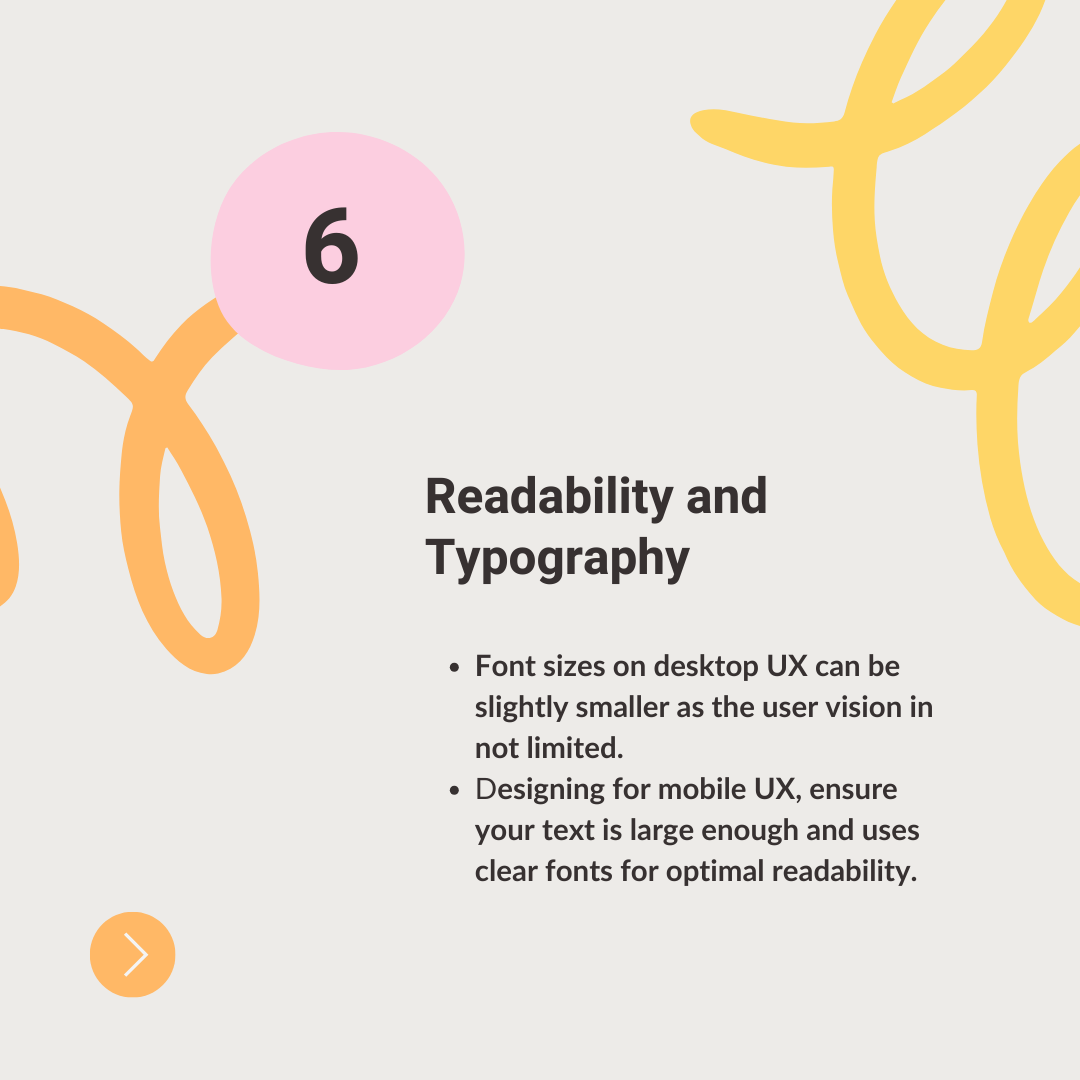
- Readability and Typography
Text is an important element in the mobile vs desktop design debate. When designing for mobile UX, ensure your text is large enough and uses clear fonts for optimal readability.
While font sizes on desktop UX can be slightly smaller, mobile UX often benefits from using slightly larger fonts to accommodate smaller screens and potential user vision limitations.
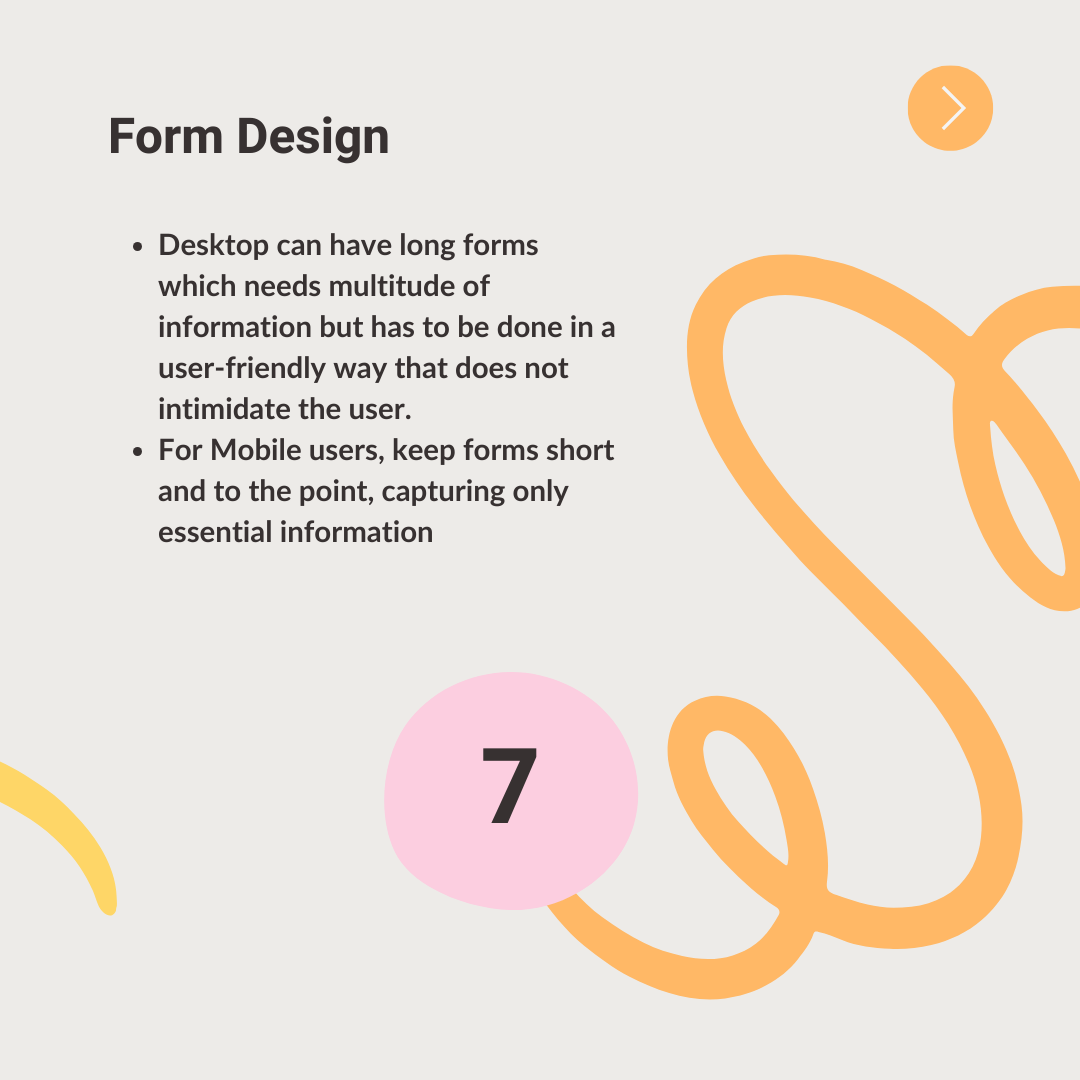
Test your website on various mobile devices to ensure text remains crisp and easy to read across different screen sizes and resolutions. - Form Design
Designing user-friendly forms that do not intimidate requires a careful approach. For mobile users, keep forms short and to the point, capturing only essential information.
Leverage features like autocomplete and pre-populated fields to minimize typing on smaller screens.
If extensive data is needed, consider breaking the form down into manageable multi-step sections. - Accessibility
Accessibility remains key for both desktop and mobile. Ensure your website uses proper semantic HTML for clear structure, implements clear focus indicators for form elements, and incorporates descriptive alt text for images, making your website usable for everyone.
Convergence: The Future of Mobile vs Desktop Design
The gap between mobile UX and desktop UX is likely to continue narrowing as technology advances. Emerging trends like foldable phones and voice-based interfaces will further challenge traditional design paradigms.
The future lies in creating a unified user experience that seamlessly adapts to the device and context in which users interact with your website.
By embracing the best practices for mobile-first design philosophy and staying at the forefront of these trends, you can ensure your website delivers an exceptional user experience regardless of the screen.
Follow us for more on LinkedIn