User interfaces (UI) are pivotal in shaping the digital experience. Good UI design facilitates smooth user interaction, but when it falters, the cracks quickly show. This article highlights 15 common user complaints that signal UI problems, guiding designers and developers to create more user-friendly interfaces.
Table of Contents
| Common User Complaints Decoded in UI Design Terms |
| 1. Navigation Nightmares |
| 2. Inconsistency in UI Design |
| 3. Slow to Load Interface |
| 4. Jargon Overload |
| 5. Non-Responsive Designs |
| 6. Poor Accessibility |
| 7. Overwhelming Layouts |
| 8. Absence of User Action Feedback |
| 9. Complex Forms |
| 10. Poor Readability |
| 11. Disorganized Content |
| 12. Vague Error Messages |
| 13. Ignoring User Feedback |
| 14. Poor Onboarding Experience |
| 15. Overemphasis on UI Design Trends |
Common User Complaints Decoded in UI Design Terms
In the realm of digital products, the user interface (UI) stands as the bridge between technology and user experience. Seamless UI design enhances user interaction, while a problematic UI can detract from the overall experience, leading to user frustration and disengagement.
Recognizing the signs of UI issues is crucial for designers and developers aiming to refine their digital offerings. So, based on our experience in the field, we have listed 15 common complaints that indicate you have a UI problem at hand. The article discusses the UI issues these complaints signal and how to address them.
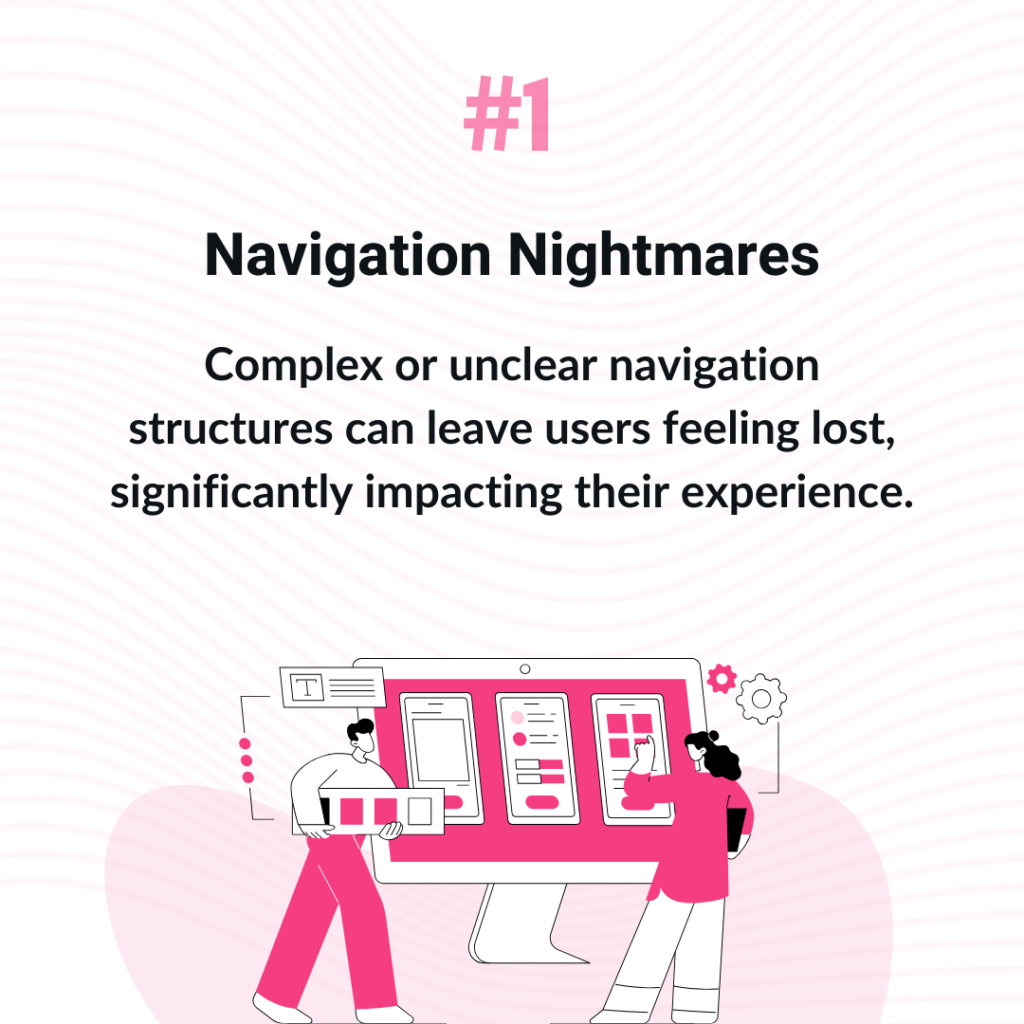
1. Navigation Nightmares
“I can’t find my way around“. Ever felt lost within an app or website? That sinking feeling when you can’t find what you need speaks volumes about the navigation’s design flaws.
Complex or unclear navigation structures can leave users feeling lost, significantly impacting their experience. In contrast, intuitive UI design guides users to their desired content with ease.
Enhancing navigation may involve simplifying menus, using familiar icons, and ensuring the most important information is easily accessible. This is especially important in context of SaaS UI.
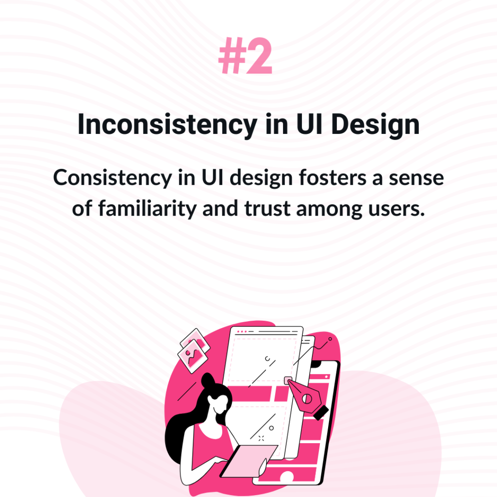
2. Inconsistency in UI Design
“Why does this look different?” Consistency in UI design fosters a sense of familiarity and trust among users. Stumbling upon mismatched fonts or jarringly different button styles disrupts the user experience.
When elements like buttons, fonts, and colour schemes vary widely across a platform, it undermines the user’s ability to predict interactions, potentially harming the brand’s reputation.
Achieving design consistency involves setting and adhering to style guidelines that align with the brand’s identity.
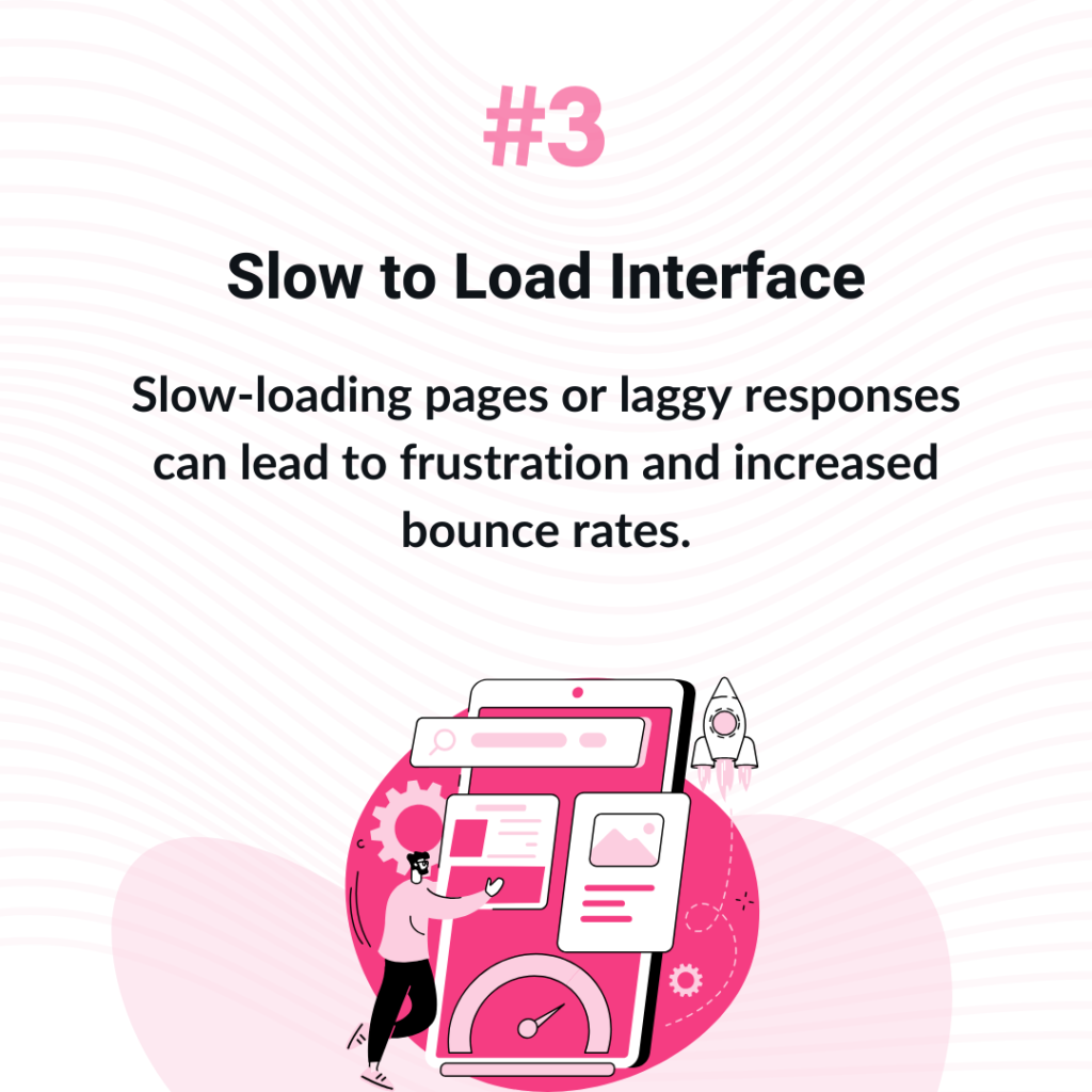
3. Slow to Load Interface
“It takes forever to load!” In an age where time is of the essence, Speedy responses are not just preferred; they are expected for a seamless online experience.
Users expect quick responses from the interfaces they interact with. Slow-loading pages or laggy responses can lead to frustration and increased bounce rates.
Optimizing images, leveraging caching, and minimizing the use of heavy scripts can significantly improve load times and responsiveness in your SaaS UI Design
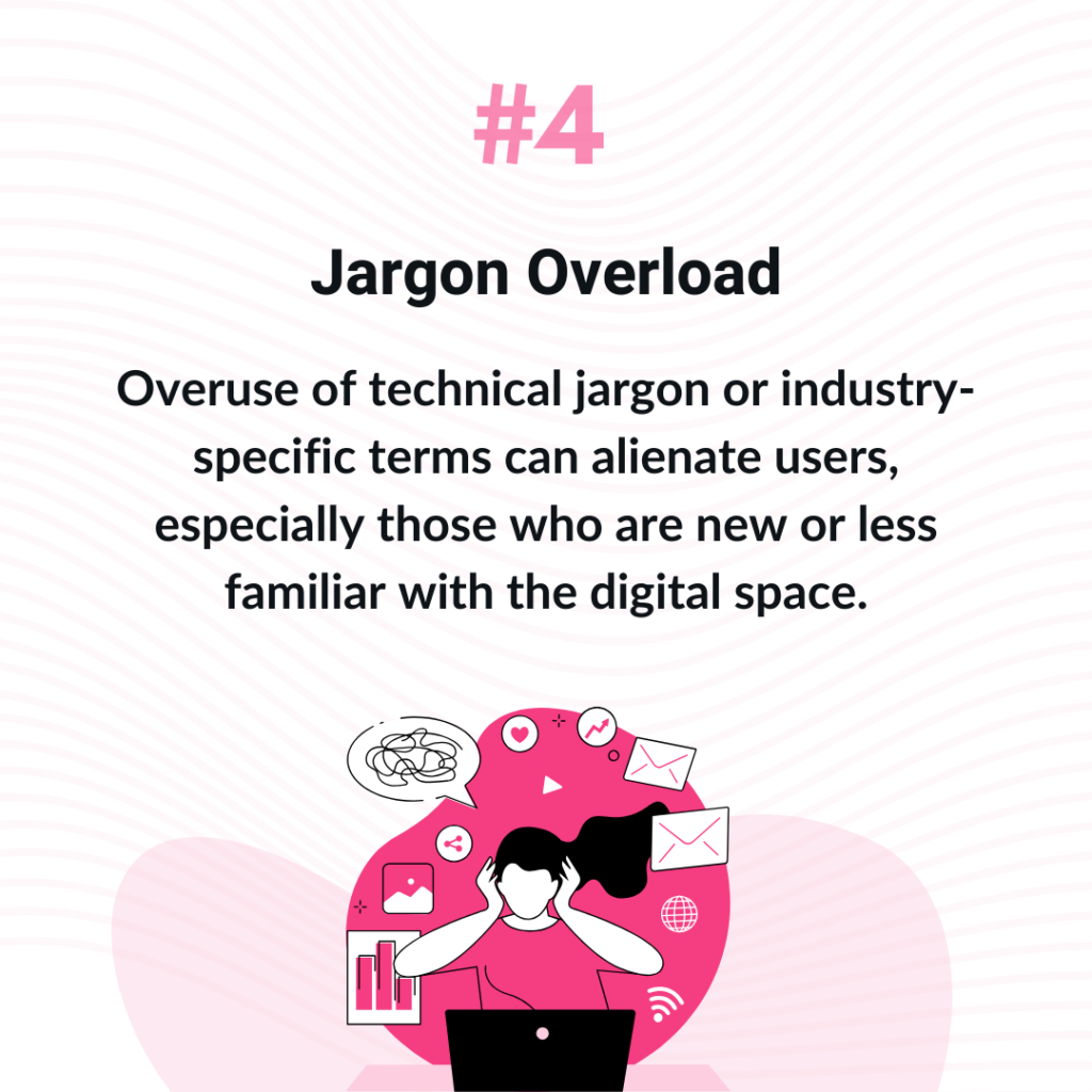
4. Jargon Overload
“What does this even mean?” Overuse of technical jargon or industry-specific terms can alienate users, especially those who are new or less familiar with the digital space.
Clear and straightforward communication is critical to a user-friendly UI design. Simplifying language and including helpful tooltips or glossaries can enhance understanding and accessibility.
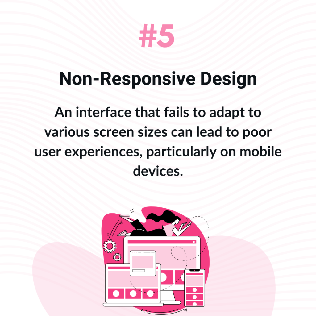
5. Non-Responsive Design
“Why doesn’t this work on my phone?” Ever opened a website on your phone only to find it nearly unusable? It is so annoying. With the diversity of devices used to access digital content, responsive design has become non-negotiable.
Users expect a UI design that can switch from desktop to mobile seamlessly. An interface that fails to adapt to various screen sizes can lead to poor user experiences, particularly on mobile devices.
SaaS UI design practitioners understand employing responsive design practices ensures that content is accessible and appealing across all devices.
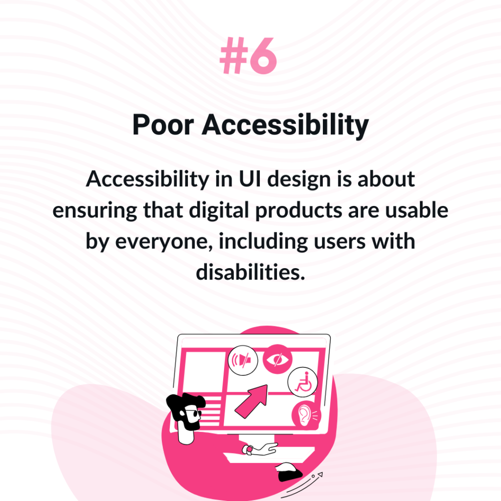
6. Poor Accessibility
“Why isn’t it built to accommodate my needs?” Accessibility in UI design is about ensuring that digital products are usable by everyone, including users with disabilities.
Ignoring accessibility can exclude a significant portion of the population. Incorporating accessibility features like keyboard navigation, screen reader support, and sufficient colour contrast makes the UI more inclusive.
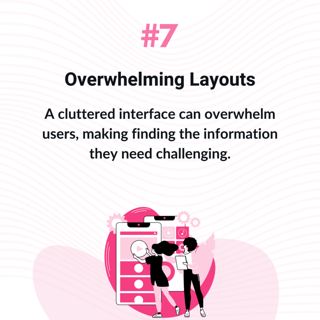
7. Overwhelming Layouts
“Where do I look?” A cluttered interface can overwhelm users, making finding the information they need challenging.
Good UI design involves streamlining the layout, using whitespace effectively, and prioritizing content based on user needs to create a more enjoyable browsing experience.
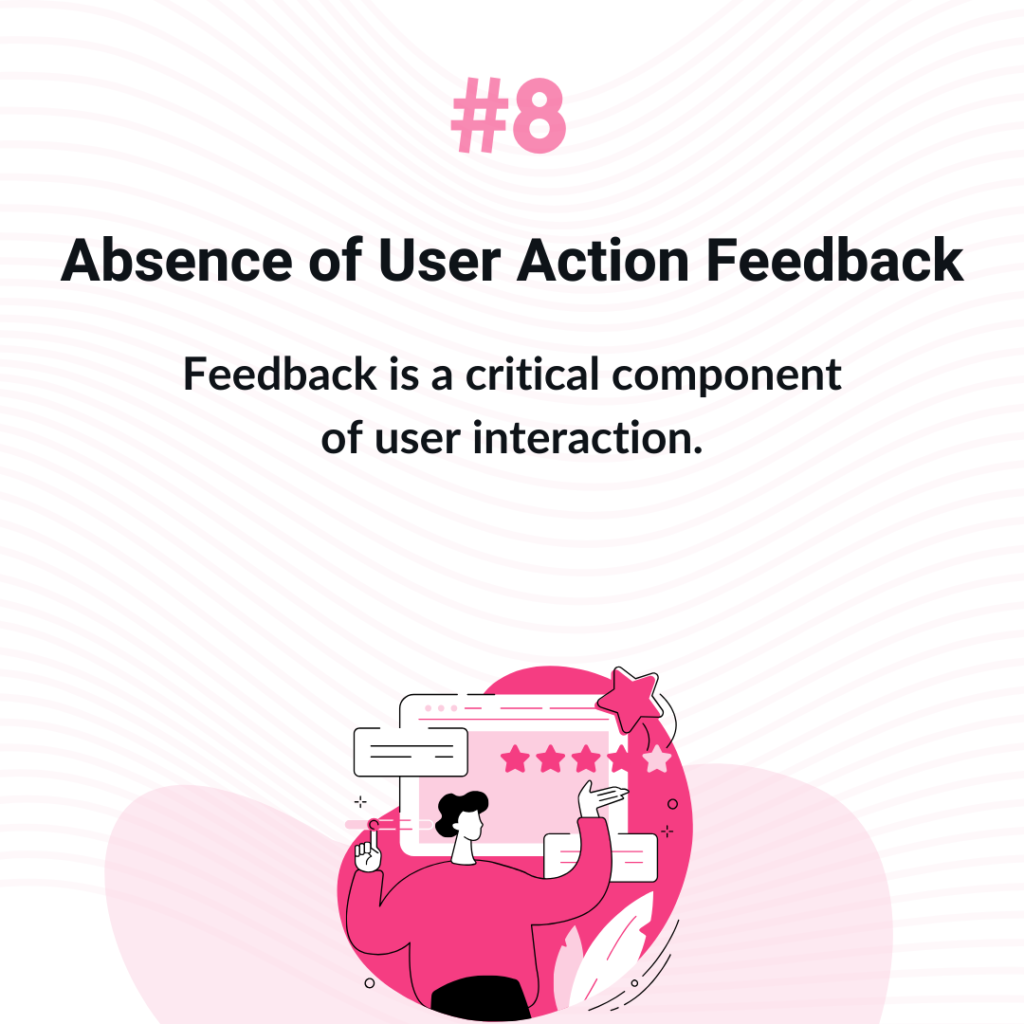
8. Absence of User Action Feedback
“Did my click even register?” Feedback is a critical component of user interaction. When users take an action, they expect some form of acknowledgment or response. Providing immediate feedback, such as visual indicators or confirmation messages, reassures users that their actions have been recognized.
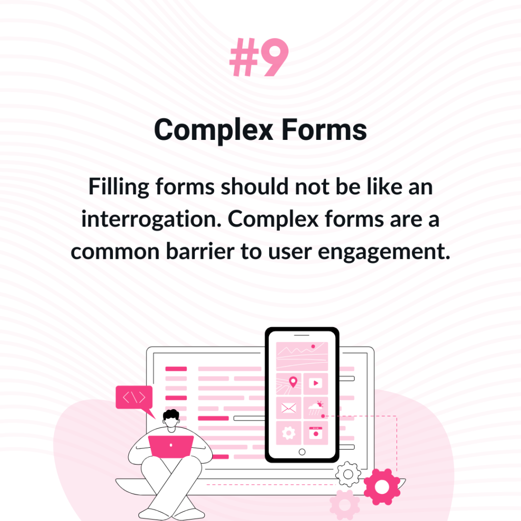
9. Complex Forms
“Why is this form so complicated?” Filling forms should not be like an interrogation. Complex forms are a common barrier to user engagement.
Sound UI design principles recommend simplifying forms, asking only for essential information, and providing clear instructions to reduce user frustration and increase completion rates.
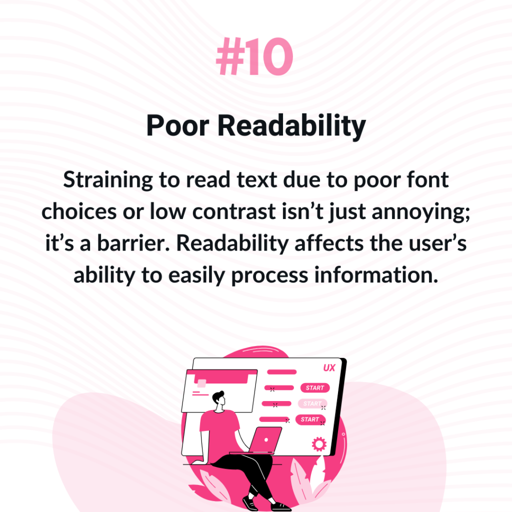
10. Poor Readability
“This is so difficult to read!” Straining to read text due to poor font choices or low contrast isn’t just annoying; it’s a barrier. Readability affects the user’s ability to easily process information.
Poor font choices and low colour contrast can strain the eyes and detract from the user experience. Selecting legible fonts and ensuring high contrast between text and background improves readability and user satisfaction.
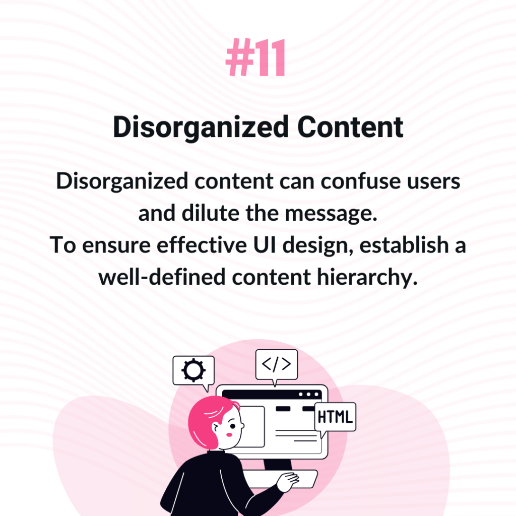
11. Disorganized Content
“Where do I look first?” Disorganized content can confuse users and dilute the message.
To ensure effective UI design, establish a well-defined content hierarchy. Organize content logically and use headings, lists, and visual cues to guide users through the information effectively.
This will help users navigate content and understand its relative importance easily.
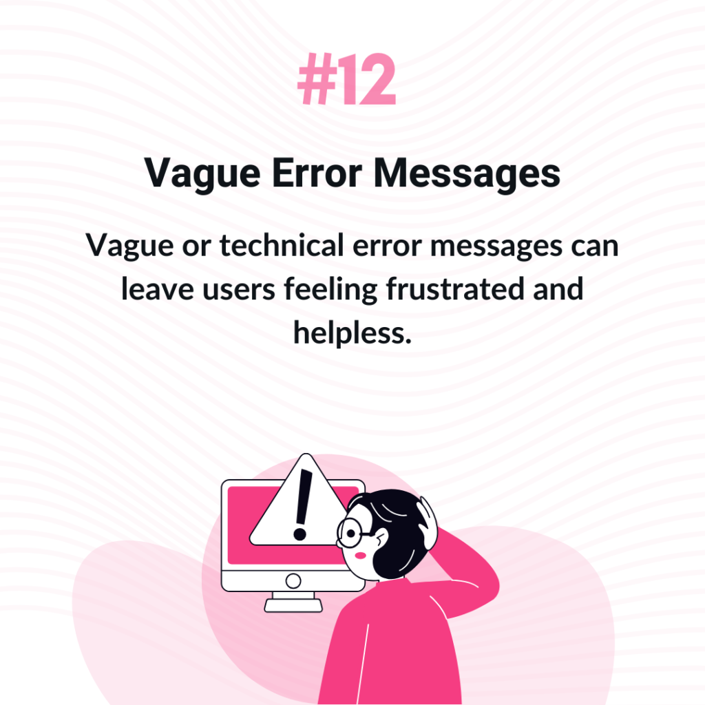
12. Vague Error Messages
“What am I supposed to understand from this error message?” Vague or technical error messages can leave users feeling frustrated and helpless.
If the UI design is good, error messages will be crafted to provide clear guidance on next steps if the user encounters unexpected issues.
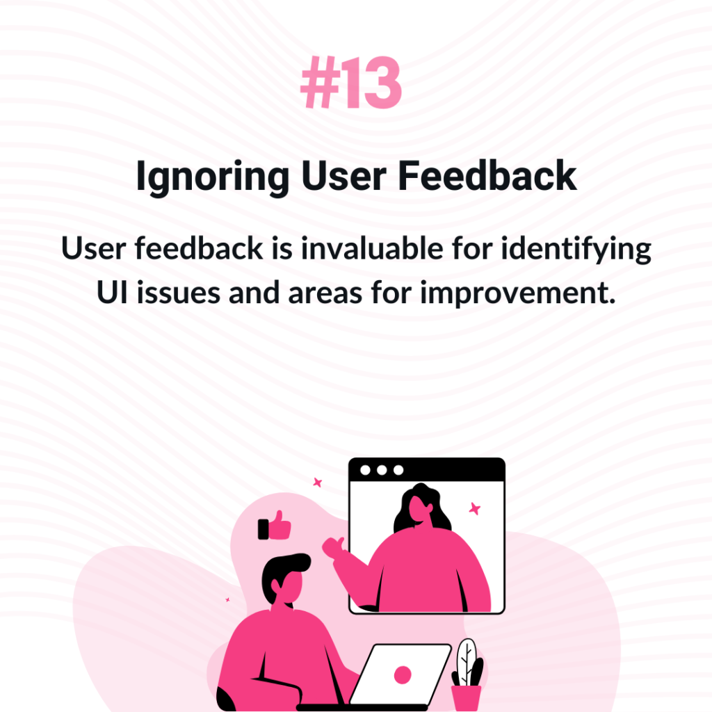
13. Ignoring User Feedback
“I wish they would understand what I need!” User feedback is invaluable for identifying UI issues and areas for improvement. Disregarding user feedback can lead to missed opportunities for enhancement and innovation.
Establishing channels for user feedback and actively incorporating insights into UI updates demonstrates a commitment to user satisfaction.
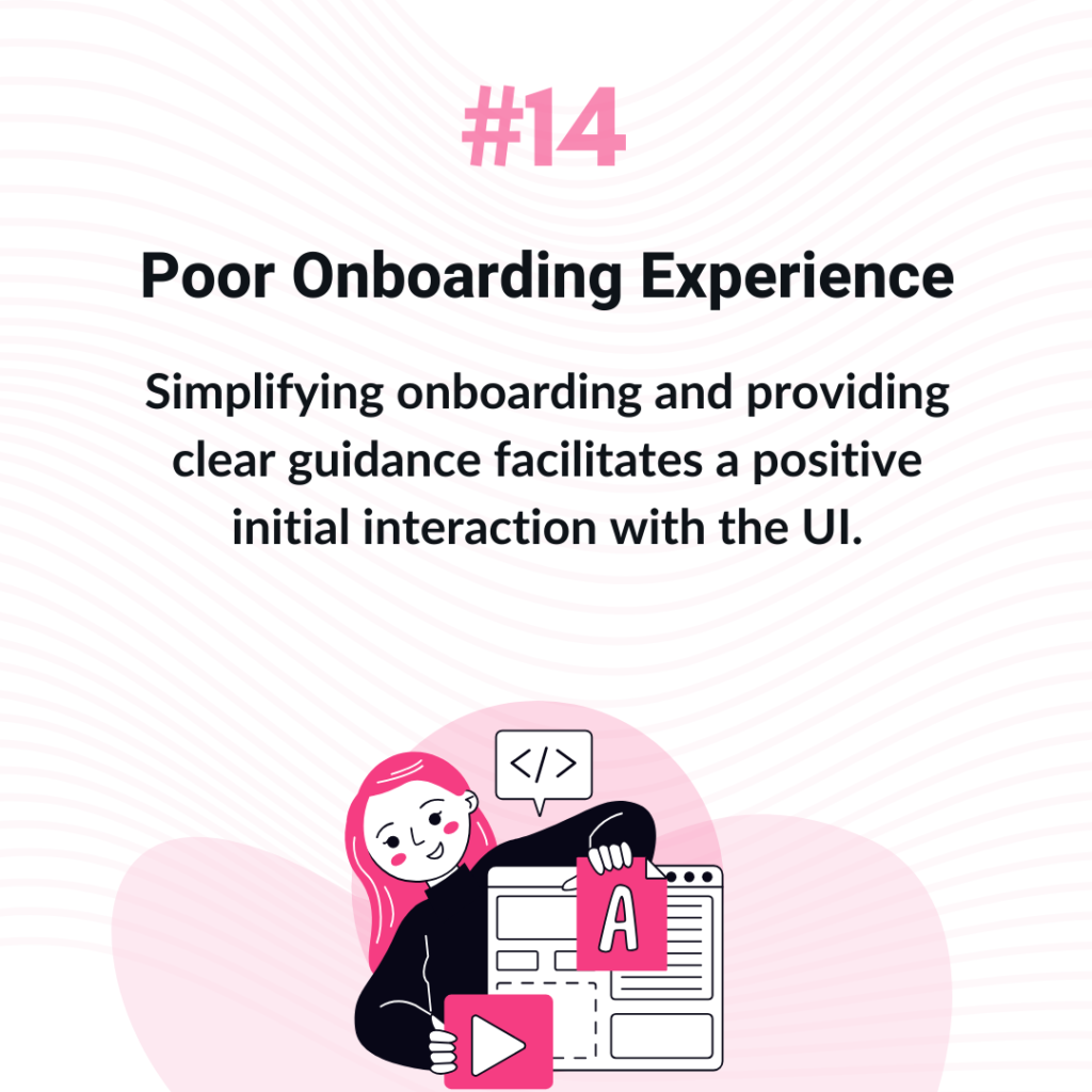
14. Poor Onboarding Experience
“How do I even use this?” A confusing or overly complex onboarding experience can result in user frustration and abandonment.
Good UI design offers users an effective onboarding process that smoothly introduces them to the interface, helping them understand its features and functionalities.
Simplifying onboarding and providing clear guidance facilitates a positive initial interaction with the UI.
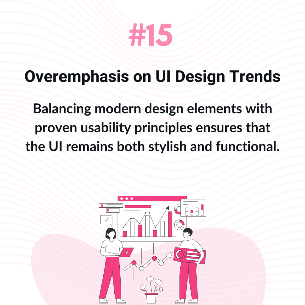
15. Overemphasis on UI Design Trends
“Looks nice, but I can’t use it!” While staying current with design trends is important, functionality should not be sacrificed for style. An overemphasis on trends can lead to UI designs that prioritize aesthetics over usability, potentially confusing users.
Balancing modern design elements with proven usability principles ensures that the UI remains both stylish and functional.
Conclusion: Striking the Right Balance
By focusing on enhancing user experience, prioritizing accessibility, and embracing a user-centric approach to UI design, developers and designers can create UIs that not only look great but also meet the practical needs of users. Beon is dedicated to helping businesses achieve this balance, crafting intuitive and engaging UI designs that drive user satisfaction and success.
Follow us for more on LinkedIn